VISUALIZATIONS
A friend asked me to collect some interesting visualizations and comment on them…
This communication map shows the company’s strategy in developing excellence; the playful designation of excellence as E2 evokes Albert Einstein’s formula for energy, lending the concept an air of scientific significance. The concept ”strategy” is properly depicted as a journey (airplane flight) and a communication flow (the flight tower directing the individual airplanes). The image is colorful and dynamic, adding curvature to an otherwise fairly predictable flow. The visual design harkens back to the LEGO boxes, which fascinate because they show incredible detail composed out of relatively simple shapes. The 3D perspective helps us to understand the communication as an ”in-depth” process and not just a linear flow. The disadvantage is that the end point of the journey left me wondering: it is at once distant (unreachable?) and confused (I do not recognize the shape which is supposed to depict future success) Some bright rays of light could have solved the problem. Also, if I had the choice, I would use organic drawing instead of the (overused) vectorial illustration.
This visualization blends advertising and infographics strategies. It looks like you’re simultaneously observing an advertisement for commercial products, and a taxonomic study of species that you’d find in a biology book. The disciplined three-column design suggests order, while the objects made of trash introduce chaos – you do not expect to see trash being sold in catalogs. The cognitive dissonance created by this contrast manages to grab your attention without being too obvious. In this way, the poster’s somewhat didactic message about ecology becomes more accessible.
Here the designer breaks the ”rule” of simplicity that is central to data visualizations. He wants to show the perplexing complexity of the situation that there are too many medications available for the same condition (headache). But in playing against type, the designer manages to satisfy another important principle of good design – the medium is the message. The central pattern expresses the message directly, as the vortex-like visual structure perfectly embodies vertigo caused by too many choices. At the same time, the vortex ”pulls us in”, we are attracted to the image…
My complaint is that more images should be used. I cannot discern on first glance that this is about a pharmaceutical subject. Some images of bottles and pills could have solved the problem.
I like the way this visualization deploys storytelling principles. It has a beginning, a middle, and an end. The introduction clearly delineates the problem: how to find the balance between ”underemployment” and ”overemployment”. This is supported by the graphical design of the title (escalating/descending letters) and the visual structure of the scales. The textile in the background neatly evokes industrial imagery / reflects the subject. The problem is that the question does not lead to a clear answer. The text in the end says that ”in the future, people will be constantly changing careers”. I do not understand how and why we came to this conclusion. From the images in the middle, I would rather draw the conclusion that unemployment oscillates in time, due to changing work conditions. This means that people need to develop adaptability. Also, the last image chosen does not show ”side skills”. It merely suggests diverse skills.
The horizontal ordering of images is static and dull. A timeline shaped like the title would better reflect the nature of the process. The choice of photographs is rather conventional for my taste, and they are difficult to read / have too many details. This could have been solved by the use of political-style cartoon, for example.
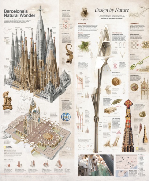
This presentation accomplishes a very difficult task: synergy between design and information. The images are gorgeous to look at, but also very studied, realistic. It is like a beautifully designed technical manual. The designers were helped to a great extent by the brilliance of the subject, the organic forms in Sagrada Familia. Still it is admirable that such detailed and complex forms can be represented in such clear and disciplined way.
I am of two minds about this visualization. Character design is put to good use, allowing the viewer to identify with the subject on a gut level. We all recognize the gesture & condition being depicted. The choice of color and lettertype convincingly conveys the style of a food & beverages company. On the other hand, the visualization takes absolutely no risks – everything is so well-designed and ordered, it could be any other McDonald’s or Burger King poster. This could have been solved by the use of unconventional fonts, or by adding more character design, or changing the static visual structure…


